Today's labours...
Saturday, 24 January 2009
Friday, 23 January 2009
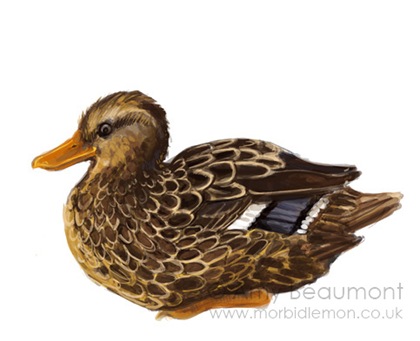
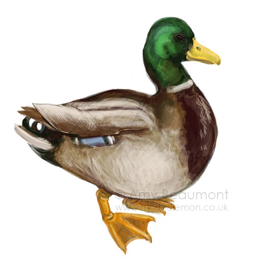
Mallards are Well-hard
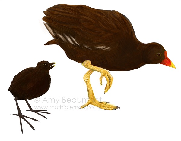
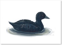
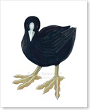
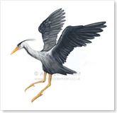
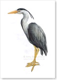
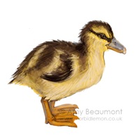
Actually they're not, but that's besides the point. Progress is finally being made on the illustrations for Meanwhile Gardens, at some point I'll transfer the entries for that into this blog. I re-thought my approach to painting these and I'm leaving them fairly rough - I had been getting too bogged down in detail because I've been painting them at such a high resolution, so I'm keeping the print size in mind [and so getting through it far more quickly]. It's also resulting in illustrations that I think are more aesthetically pleasing because they aren't getting too polished [like my bugs did] so they're retaining the character of the pencils.
After being ill the other week I've been set back quite a lot, and my schedule has been all over the place. But I think now I'm caught up with immediate things so I can settle back into the timetable I had set for myself. It sounds really anal but it really keeps me sane; Monday - Macmillan, Tuesday/Wedesday/Thursday - College work, Friday/Saturday - Meanwhile, Sunday - Day Off [theoretically, at least - it's more likely to be a catch up day, but it's the thought that counts, right?]
Thursday, 22 January 2009
Monday, 19 January 2009
Paintings of Greek Myths
Thought I would share some of the paintings I've been looking at that depict Greek myths. It's so nice to be able to enjoy this kind of painting without the brutal Christian overtones that have always put me off renaissance and similarly-styled work. The importance of realism and correct anatomy reflects the Greeks well since they had such a preoccupation with physical perfection [ie. muscles galore]. It's important to me in the way I work too, I've always aimed to be able to draw things how we see them believing it needs to be the foundation for other ways of working. Although I'm less aggressive with that point of view than I was when I was younger! [Hang on, you're only twenty, you can't talk like that."]
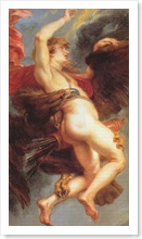
I've included here The Rape of Ganymede by Peter Paul Rubens because of how dynamic the pose is [I also happen to love birds but that didn't come into it]. I went for a drawing day with a couple of my drawing tutors from my first year elective back in November [or was it October?] at the National Gallery as part of The Big Draw. I will admit that I never understood the value of drawing from other people's work [I never did it at school] with the reasoning, "If I copy their mistakes, and then make my own mistakes in doing so, surely I'll just end up with a big mess?!" But I really enjoyed it. I had briefly seen the three paintings we would be drawing from before I went and didn't really like the look of the first two - they were both very religious, one of them having an obscene amount of gold in it, and I thought I'd enjoy the third - Experiment with an Air Pump by Joseph Wright far more. It still is my favourite of the three we drew from, but the other two were far more interesting and useful to draw from with their dynamic figures.
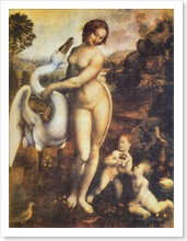
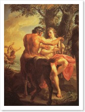
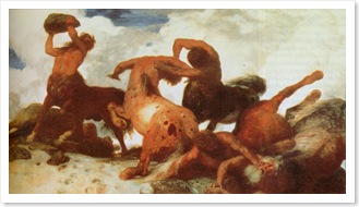
I really enjoy The Education of Achilles by Pompeo Batoni because of the Centaur and how the artist has constructed the anatomy of him so beautifully from studying men and horses. It just struck me as really well done, especially since there's so much in the way of fantasy art that has no regard to anatomy. Leda by Leonardo da Vinci is partly here because I really love da Vinci's work [although his drawings more-so], but mostly because of Claude's Swan Zeus [if da Vinci can paint swans without the black bit around the eyes...] Although it seems as though the designers of the book I have decided to flip the painting over to better the page composition...
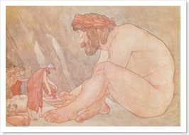
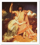
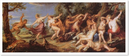
A selection of other paintings [plus one illustration] that I've picked out during my reading. An illustration from a book of Homer's tales, some more centaurs, a painting of a big powerful god [one book says it's Zeus, another says it's Jupiter] as my Zeus looks pretty weedy I thought I would get some tips for him to bulk up, and lastly a dynamic scene that I mostly picked for the Satyrs [which feature briefly in my myth]. Phew.
Physiognomy
[fiz-ee-og-nuh-mee, -on-uh-mee]
–noun, plural -mies.
1. the face or countenance, esp. when considered as an index to the character: a fierce physiognomy.
2. Also called anthroposcopy. the art of determining character or personal characteristics from the form or features of the body, esp. of the face.
3. the outward appearance of anything, taken as offering some insight into its character: the physiognomy of a nation.
Every so often I come across a word that I find really interesting but never share it with anyone, so I think I'll start doing that here... This one is particularly fitting with illustration; it hit me as awesome that there's actually a word for this.
Perhaps I am too easily amused.
Saturday, 17 January 2009
The Cabinet of Dr Caligari
Finally had the pleasure to watch the Cabinet of Dr Caligari this week - I knew LoveFilm would come in useful at some point. It relates to my animation because it is a silent film and the score really reflects the atmosphere of the narrative. The film goes through various colour tints, denoting time of day and location. I really like the use of vignettes to 'pan in' to subjects, although this was out of necessity. Light and dark are exploited, particularly in the facial expressions of Doctor Caligari and Cesare.
My favourite thing about the film though, has to be the beautiful sets, thanks to the German expressionist movement. As they are entirely fabricated the director had full control over the composition of each shot, and many scenes employ white painted shapes to give a sense of movement and space. They are abstract and get gradually more surreal as the plot progresses in its bizarre way. Each scene could be a painting and they really appeal to me, but I'm not sure their dark quality [the sort of thing I'm usually drawn to] would suit my narrative.
Of the scenes, I particularly like the staircase and prison cell [with the cross painted on the floor], and also the mountains. The pace of the film felt quite slow, but if the scenes were cut short I imagine much of the 'suspense' would have been lost. I guess I should to mention my enjoyment of the "Du musst Caligari werden" sequence, where the obsessive thoughts of the doctor are visualised in the space. I wonder if there is a place for text within my animation?
The DVD has an audio essay which I haven't had chance to watch yet, I hope I'll have chance before I return it. And now for the good stuff, a selection of stills:
Wednesday, 14 January 2009
British Museum
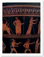
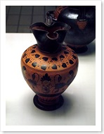
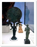
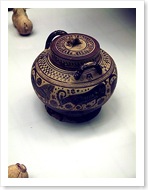
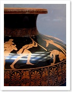
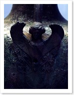
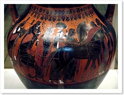
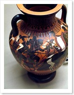
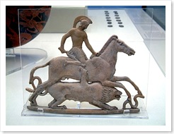
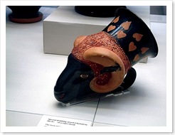
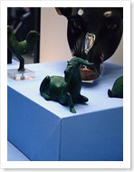
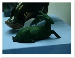
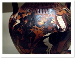
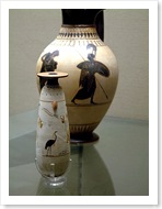
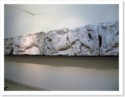
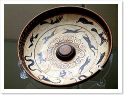
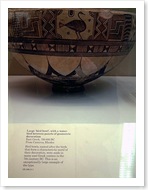
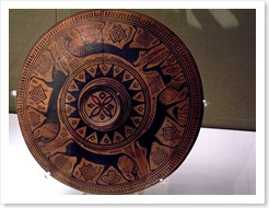
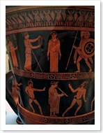
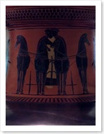
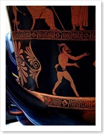
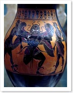
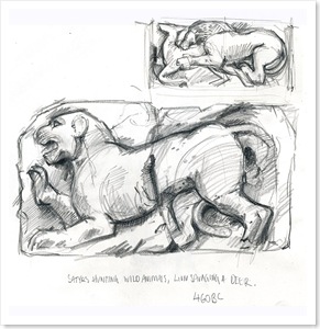
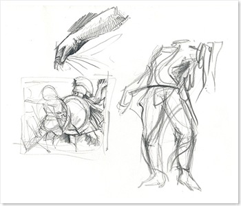
I spent a couple of hours in the British Museum on Friday after a meeting with Phil at Meanwhile. Spent most of the time looking at the Greek pots and some of the friezes. My camera was playing up so I didn't get as many photographs as I wanted, but got a little bit of drawing in too. I really like the technique that's used on some of the pots, where a ground is laid on the surface and then details scratched away - like scraper-board. There is so much detail in everything.
I find the pot paintings to be quite a contrast to Greek sculpture, the paintings are quite stylised in contrast the the realism of the sculpture; they are figurative, but the stylistic quality seems to have been enforced by the medium.
Small selection of photographs from Friday, plus a couple of drawings, I'll revisit this week to spend more time with the sculpture [when I'm not so ill...]:
Labels
- Drawing (4)
- Film (1)
- General (8)
- Illustration Friday (3)
- London Wildlife Trust (1)
- Meanwhile Gardens (4)
- Painting (2)
- Procrastination (3)
- Prometheus Animation (10)
- The Man Who Mistook His Wife For A Hat (2)
- What If? (2)


