Portfolio Sketchblog Information Miscellany

Wednesday, 22 April 2009

Studio

Back in London a year older [21 now, apparently]. I bought myself a delicious new digital camera, yum yum. Just finished tidying my studio for a week alone full of hard work [that is the plan anyway]. I love my studio, and I love seeing other peoples studios, so combine that with the new camera and you get…

 Studio 1 Studio 2

Friday, 27 March 2009

Progress?

illustration1-show

Illustration one of three – I’m flooding Africa for Darwin, naturally. I’m trying to imitate the gorgeousness that is old natural history illustration etchings. I’m particularly in love with those based on drawings by Joseph Wolf [see below]. Not to mention the delicious Une Semaine de Bonté by Max Ernst, which is collaged from wood engravings. I could spend hours poring over that book, if only I had time!

josephwolf-maternalcourage josephwolf-islandsanctuary josephwolf-grantsgazelle josephwolf-polarbear

I am delayed with the other two illustrations by my tutor suggesting I get them printed as photo-etchings, to give it a more authentic feel. Unfortunately I never made use of the facilities at uni, and I can’t afford a crash course at The London Print Studio yet. Although I will definitely explore that after I graduate because their session prices are very reasonable.

In the meantime I’m going to explore my own method of making prints. Ages ago I made prints of wasps by engraving acrylic with the help of a rotary tool, which would be inked like an etching [rather than a relief]. I’ve got myself some glass engraving needles this time, to avoid the bumpiness I found with the electric tool. I’m going to make a Bottle Jack Press [although my boyfriend wants me to make it prettier?] in a couple of weeks when I go home and have access to my mum’s array of power tools… I think it will probably be more suitable for relief printing techniques, which I’ve also been having fun with recently [nothing to show for it, as usual]. But I look forward to experimenting with it.

Also, finished the design for our degree show website: This Will Kill That Just need to get on with the content, but time is very short at the moment. Currently working on the script and page plans for The Man Who Mistook His Wife For A Hat. It’s straightforward, but I’m wasting so much time not doing it.

The large project for Meanwhile Gardens is almost at a close. Two signs and the text to finish and then we go to print. I had an interesting tour around BAF Graphics in Earlsfield last week when I was finalising the printing specifications with them – there’s been a mad rush to get the Lottery budget spent before the end of the month. I came away with “printer-envy” and a big smile on my face. I’ve also been contracted to do three more commissions for the garden in the Summer - I imagine this is the only time I will ever get paid in advance…

Hmm. What else? Animation is still on hold, and I still haven’t redesigned MorbidLemon – although I did finish the smaller logo. A few bits I want to tweak, but it won’t change much from this I don’t think.


MorbidLemon - Logo Initials

Saturday, 28 February 2009

Paralysed By Too Much To Do

Why is that always the way? Need to get moving... So, this is what I'm going to be juggling over the next few months:

- Wildlife Signs for Meanwhile Gardens
- Evolution: What If? Short Project. Between five and ten illustrations.
- Prometheus: Storyboard and animation.
- The Man Who Mistook His Wife For A Hat. Adapting one or two chapters.
- Day In Day Out. Developing own narrative into a comic/graphic novel format.
- Macmillan. At least four final spreads plus pencils for all and book jacket.
- Degree show website.
- Morbidlemon re-design.

Definitely drawing the line now for work I'm taking on. I think I already took too much on, but I can't go back on it now. Wish me luck!

Wednesday, 11 February 2009

Scenery Painting

landscape2show

Was pleased with how this was coming along, inspired by Greek vases and the Cabinet of Dr Caligari, for my Prometheus animation. It's gouache. Just incase you didn't know, gouache doesn't taste nice even though I think it's yummy. I should stop biting my nails.

Also, since I hadn't posted it yet here's the storyboards I'd been working with so far. The brown one is the most recent [and most focused]. I suppose they might help give the above painting a bit more context.

 storyboardshow storyboardmach1show

It has been a rough week.

Saturday, 24 January 2009

Friday, 23 January 2009

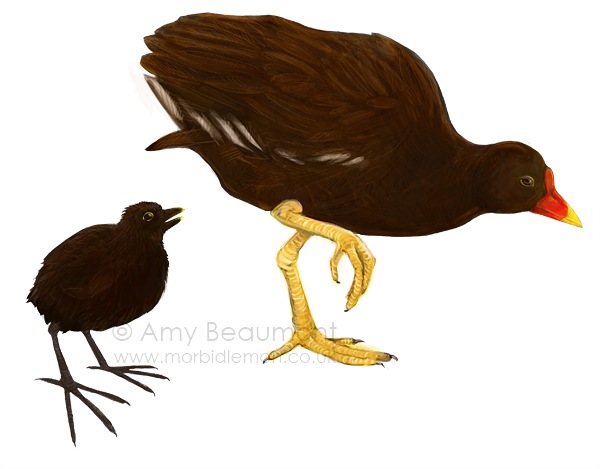
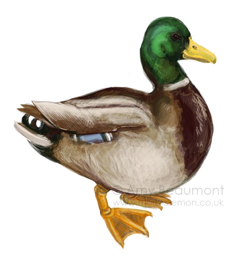
Mallards are Well-hard

 duckling-show

Actually they're not, but that's besides the point. Progress is finally being made on the illustrations for Meanwhile Gardens, at some point I'll transfer the entries for that into this blog. I re-thought my approach to painting these and I'm leaving them fairly rough - I had been getting too bogged down in detail because I've been painting them at such a high resolution, so I'm keeping the print size in mind [and so getting through it far more quickly]. It's also resulting in illustrations that I think are more aesthetically pleasing because they aren't getting too polished [like my bugs did] so they're retaining the character of the pencils.

After being ill the other week I've been set back quite a lot, and my schedule has been all over the place. But I think now I'm caught up with immediate things so I can settle back into the timetable I had set for myself. It sounds really anal but it really keeps me sane; Monday - Macmillan, Tuesday/Wedesday/Thursday - College work, Friday/Saturday - Meanwhile, Sunday - Day Off [theoretically, at least - it's more likely to be a catch up day, but it's the thought that counts, right?]

Thursday, 22 January 2009

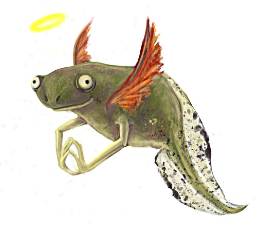
Newtlet

cherubnewtletshow


It's a newtlet. It's a cherub. It's gloriously irrelevant.

Monday, 19 January 2009

Paintings of Greek Myths

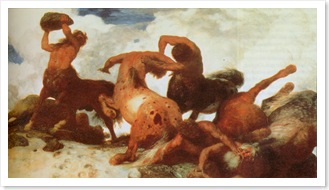
Leda, Leonardo da Vinci, Canvas, c. 1515-16.The Rape of Ganymede by Peter Paul Rubens, Canvas, 1577-1640.The Education of Achilles by Pompeo Batoni, Canvas, c. 1770.

Thought I would share some of the paintings I've been looking at that depict Greek myths. It's so nice to be able to enjoy this kind of painting without the brutal Christian overtones that have always put me off renaissance and similarly-styled work. The importance of realism and correct anatomy reflects the Greeks well since they had such a preoccupation with physical perfection [ie. muscles galore]. It's important to me in the way I work too, I've always aimed to be able to draw things how we see them believing it needs to be the foundation for other ways of working. Although I'm less aggressive with that point of view than I was when I was younger! [Hang on, you're only twenty, you can't talk like that."]

I've included here The Rape of Ganymede by Peter Paul Rubens because of how dynamic the pose is [I also happen to love birds but that didn't come into it]. I went for a drawing day with a couple of my drawing tutors from my first year elective back in November [or was it October?] at the National Gallery as part of The Big Draw. I will admit that I never understood the value of drawing from other people's work [I never did it at school] with the reasoning, "If I copy their mistakes, and then make my own mistakes in doing so, surely I'll just end up with a big mess?!" But I really enjoyed it. I had briefly seen the three paintings we would be drawing from before I went and didn't really like the look of the first two - they were both very religious, one of them having an obscene amount of gold in it, and I thought I'd enjoy the third - Experiment with an Air Pump by Joseph Wright far more. It still is my favourite of the three we drew from, but the other two were far more interesting and useful to draw from with their dynamic figures.

I really enjoy The Education of Achilles by Pompeo Batoni because of the Centaur and how the artist has constructed the anatomy of him so beautifully from studying men and horses. It just struck me as really well done, especially since there's so much in the way of fantasy art that has no regard to anatomy. Leda by Leonardo da Vinci is partly here because I really love da Vinci's work [although his drawings more-so], but mostly because of Claude's Swan Zeus [if da Vinci can paint swans without the black bit around the eyes...] Although it seems as though the designers of the book I have decided to flip the painting over to better the page composition...

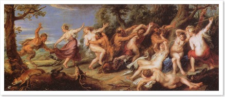
A selection of other paintings [plus one illustration] that I've picked out during my reading. An illustration from a book of Homer's tales, some more centaurs, a painting of a big powerful god [one book says it's Zeus, another says it's Jupiter] as my Zeus looks pretty weedy I thought I would get some tips for him to bulk up, and lastly a dynamic scene that I mostly picked for the Satyrs [which feature briefly in my myth]. Phew.

Illustration from Stories from Homer, 1885. Illustration by Glenn Steward, 1995.Zeus and Thetis by Jean-Auguste Ingres, Canvas, 1811.Diana's Nymphs Chased by Satyrs by Peter Paul Rubens, Canvas, c. 1670.

Physiognomy

[fiz-ee-og-nuh-mee, -on-uh-mee]
–noun, plural -mies.

1. the face or countenance, esp. when considered as an index to the character: a fierce physiognomy.
2. Also called anthroposcopy. the art of determining character or personal characteristics from the form or features of the body, esp. of the face.
3. the outward appearance of anything, taken as offering some insight into its character: the physiognomy of a nation.

Every so often I come across a word that I find really interesting but never share it with anyone, so I think I'll start doing that here... This one is particularly fitting with illustration; it hit me as awesome that there's actually a word for this.

Perhaps I am too easily amused.

Saturday, 17 January 2009

The Cabinet of Dr Caligari

Finally had the pleasure to watch the Cabinet of Dr Caligari this week - I knew LoveFilm would come in useful at some point. It relates to my animation because it is a silent film and the score really reflects the atmosphere of the narrative. The film goes through various colour tints, denoting time of day and location. I really like the use of vignettes to 'pan in' to subjects, although this was out of necessity. Light and dark are exploited, particularly in the facial expressions of Doctor Caligari and Cesare.

My favourite thing about the film though, has to be the beautiful sets, thanks to the German expressionist movement. As they are entirely fabricated the director had full control over the composition of each shot, and many scenes employ white painted shapes to give a sense of movement and space. They are abstract and get gradually more surreal as the plot progresses in its bizarre way. Each scene could be a painting and they really appeal to me, but I'm not sure their dark quality [the sort of thing I'm usually drawn to] would suit my narrative.

Of the scenes, I particularly like the staircase and prison cell [with the cross painted on the floor], and also the mountains.  The pace of the film felt quite slow, but if the scenes were cut short I imagine much of the 'suspense' would have been lost. I guess I should to mention my enjoyment of the "Du musst Caligari werden" sequence, where the obsessive thoughts of the doctor are visualised in the space. I wonder if there is a place for text within my animation?

The DVD has an audio essay which I haven't had chance to watch yet, I hope I'll have chance before I return it. And now for the good stuff, a selection of stills:

caligari-389754caligari-397023caligari-389898caligari-390863caligari-392200caligari-402561caligari-392372caligari-392463caligari-392706caligari-393234caligari-393314caligari-393694caligari-393997caligari-394072caligari-394153caligari-394243caligari-394721caligari-395711caligari-396716caligari-397705caligari-398012caligari-398637caligari-401033caligari-401740